Blockhead
Our love of music prompted this foray into album cover design. If you listen to Blockhead, then you will surely recognize the underground ethos we used for ‘Attack The Doctor’.
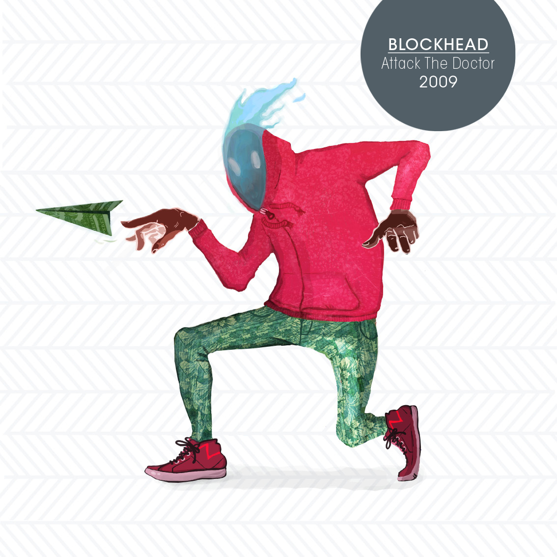
Our love of music prompted this foray into album cover design. If you listen to Blockhead, then you will surely recognize the underground ethos we used for ‘Attack The Doctor’.
The project was all about making a can of sardines cute and appealing. We chose a bold color scheme with a subtle use of illustration and used them throughout the logo and package design. This personal, modern approach turns every ‘Sea Pride’ can into a fisherman’s story waiting to be told.
This is a go at reimagining an outdated logo for a Romanian brand that has years of tradition behind it. The solid lines add a modern touch and make the character friendly and instantly recognizable. As with all our designs, we went through many iterations till reaching a final design we were happy with.

We aimed at creating a design that would compliment an organic food and drink truck. The color palette reflects the trendy, quaint idea, as well as the fresh produce used
This logo perfectly suits an Asian influenced slow-food restaurant. We wanted to mirror the intricate use of flavors in the extended flourishes of the lettering.