Hi, Razvan here!
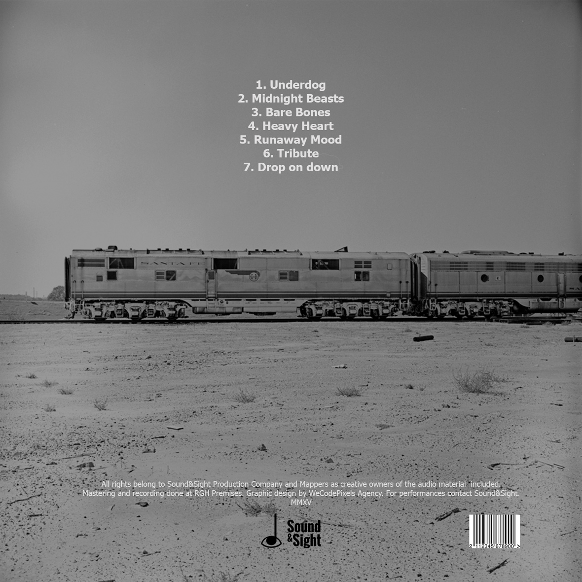
I worked on a personal project were I created album covers for artists spanning various genres of music such as folk, pop/electronic, and rock and since I wanted my design to be as detailed as possible I needed a logo of a music label to use on promotional materials like CDs and posters. This was something that I had been wanting to do for a while so I ended up being quite picky and took my time in choosing the final draft.
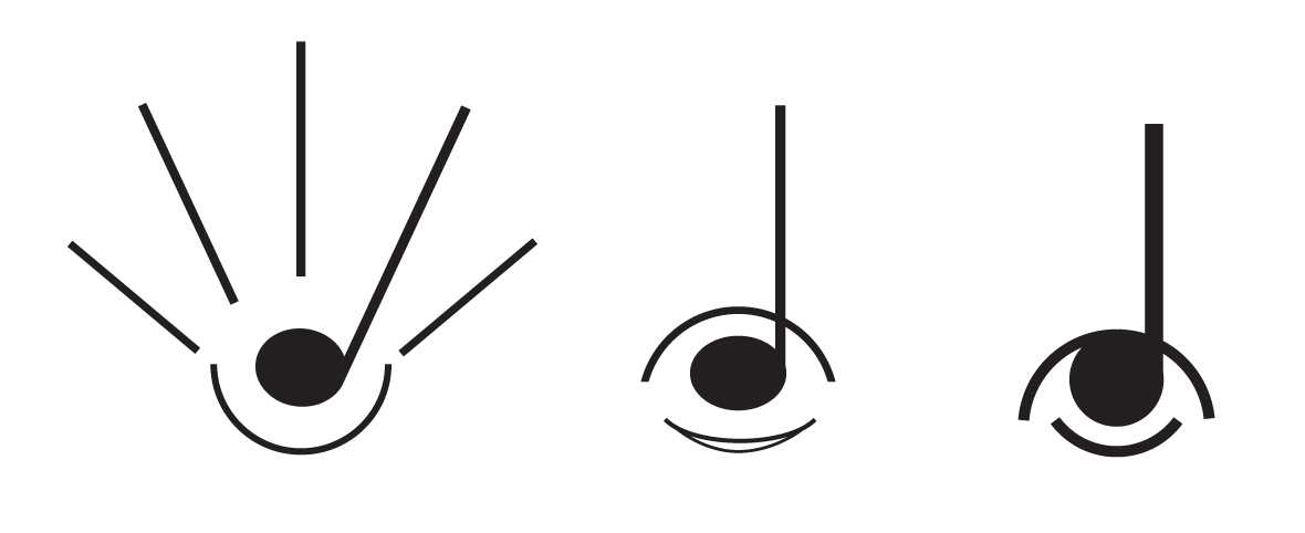
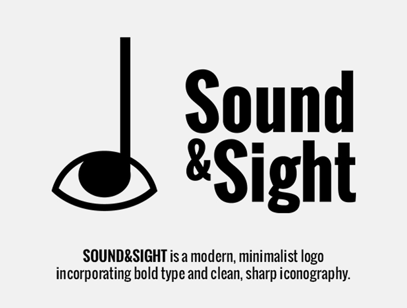
I started by trying to find a name that would reference the artistic aspect and move away from big-business type names; Fueled By Ramen always stuck in my mind as a name that brings the artists closer to the label. I tried to think about how visual and musical creativity are connected and can inform each other. I decided to base the name on the phrase ‘sight and sound’ because of its melodic alliteration but that changed to ‘Sound&Sight‘ when I realized the music was pivotal in developing the style and content of the covers and that should come first.
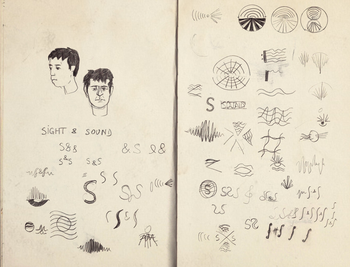
I started sketching things out on paper, playing around with various visual metaphors for the name and the relationship between the two senses. At this stage, I was more concerned with form and space than with accurate rendering and I already knew I wanted something synthetic and understated, almost scientific: wave forms or abstract marks. I stayed away from a heavily textured, grungy line because I didn’t want the logo to be pigeonholed as supporting a specific genre of music.